📊 One of the most requested features in ATOM Mobility is finally live. Meet Popular route heatmap – a new analytics layer that shows which streets and areas your riders actually use most, based on real ride data over time.
Until now, operators could see where rides start and end. Now you can see how people move in between.
Why it matters?
With Popular Route Heatmap, operators can:
🚲 Optimize vehicle placement based on real rider behavior
🏙️ Support discussions with municipalities using clear, visual usage data
📍 Identify missing infrastructure where demand already exists
📊 Make smarter, data-backed operational decisions
The feature was the #1 most upvoted idea on our merchant suggestion platform for years – and we’re excited to finally ship it.
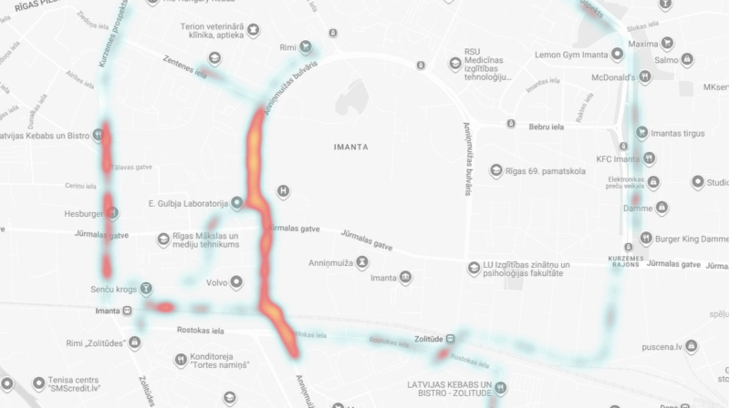
How to use it
Go to Analytics → Heatmaps
Select heatmap type Popular routes
Filter by time period and city
Zoom in to see the busiest routes your riders take
Data availability: Popular route data is available from November 1, 2025 and will continue accumulating going forward.
Inspired by how athletes analyze movement patterns with Strava – now applied to shared mobility operations.
This article was originally published by ATOM Mobility.